November 18, 2025
How I Build Landing Pages Without a Design File (Fast & On-Brand)

Building landing pages without a provided design file often feels challenging until a structured creative process replaces the missing visuals. Strong brand awareness becomes the foundation for shaping layouts that reflect identity, tone, and user expectations consistently.
Clear messaging helps guide layout choices by highlighting which elements deserve priority and which sections support persuasive flow. Content hierarchy plays a crucial role because effective landing pages rely on sequencing that motivates users to take action.
Reliable frameworks allow developers and designers to move quickly by using familiar structures proven to convert across industries. Visual decisions become simpler once color palettes, typography preferences, and spacing patterns match brand personality.
Strategic improvisation bridges the gap between missing design files and fully functional landing pages that still feel intentional. Experience often makes it easier to translate rough direction or raw text into clean, compelling page arrangements.
Momentum improves when layout choices rely on purpose rather than perfection, allowing pages to launch faster without sacrificing clarity. Confidence grows once creators realize that on-brand landing pages can be built through structure, insight, and thoughtful decision-making rather than static designs.
"Build on-brand pages confidently.
Book your creative direction call today."
Table of Contents
- The Situation: No Design File? No Problem
- How to Gather Inspiration Quickly?
- Understanding Layout vs Design References
- Building the Landing Page in Webflow or Framer
- Tips for Staying On-Brand While Moving Fast
- What to Avoid When Skipping the Design Phase?
- Free Download: 50+ Inspiration Websites
1. The Situation: No Design File? No Problem

Picture this: marketing urgently needs a landing page for a campaign, but there’s no design file in sight. The usual process—wait for the designer to finalize the design—isn’t an option. What now?
The first thing I ask is: "What sections do you need?" Most of the time, the team already has a basic structure in mind: Hero, Features, CTA, Pricing, and Footer. With that in hand, I can start gathering inspiration from my go-to resources and move forward quickly.
2. How to Gather Inspiration Quickly?

When you're pressed for time, curating references is the fastest way to ensure you stay on track. My go-to inspiration libraries are:
These platforms offer a wealth of examples for key sections like CTAs, testimonials, pricing tables, hero blocks, and more.
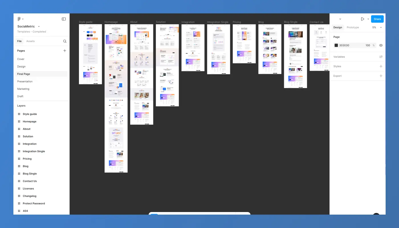
I don’t copy designs directly; I collect 2-3 screenshots of each section that match my goal for the project. These screenshots then go into a Figma file—not for designing, but for aligning the direction with the team.
This Figma file becomes a visual moodboard. It’s just a collection of screenshots, organized in order of how they’ll appear on the page: Hero, Features, CTA, etc. This gives everyone a clear visual direction and helps me build faster in Webflow or Framer.
3. Understanding Layout vs Design References

Not all inspiration is created equal. I divide inspiration into two main categories:
Layout References
These focus on structure. They help you understand where elements should be placed:
- Where to position the heading
- Where the buttons should go
- How wide the text blocks should be
- The general flow of the page
Design References
These focus on style—the visual aesthetics of the page:
- Typography and font styles
- Color palette
- Iconography
- Spacing and alignment
By separating layout and design references, I can ensure the landing page looks polished and on-brand while still moving quickly.
4. Building the Landing Page in Webflow or Framer

Now that I have my references and inspiration sorted, it's time to start building in Webflow or Framer. Here’s the process:
- Pick a Layout Reference
I’ll choose a layout reference that fits the structure I need for the section. For example, the layout for a pricing section might come from a B2B website I like, while the design reference might come from a modern eCommerce site with a great color palette. - Style It According to the Brand
I’ll apply the brand’s style guide—fonts, colors, spacing—while building the section. This ensures that while I’m borrowing ideas from different sources, the final design stays cohesive and on-brand. - Rebuild the Section
The magic happens when I rebuild the section, not by copying, but by combining the best of the layout and design references. This ensures I’m staying true to the vision without getting bogged down in the minutiae of design. - Test as You Go
I make sure everything is responsive and works across all devices. Using a style guide here is key, as it helps maintain visual balance and ensures I’m consistent throughout the page.
5. Tips For Staying On-Brand While Moving Fast

Moving fast doesn’t mean you have to sacrifice quality or brand consistency. Here are some tips to keep things aligned:
- Use a Style Guide: This is the most important tip. Having a solid style guide for typography, colors, and spacing means you can skip the guesswork and focus on building.
- Use Visual Balance: Zoom out often and look at the entire page. Does it feel cohesive, or are sections too heavy or disjointed? A quick visual check will save you time in the long run.
- Prioritize Key Elements: Focus on the most important sections first (Hero, CTA, Pricing) and refine them as needed.
6. What to Avoid When Skipping the Design Phase?

Here are some common mistakes to avoid when skipping the traditional design phase:
- Don’t Build from Memory: It’s tempting to rely on what you remember from past projects, but always pull fresh references to ensure the layout and design match the current goals.
- Don’t Skip Alignment with the Brand: No matter how fast you're moving, maintaining visual consistency with the brand is critical. Stay aligned with the company’s tone, color palette, and typography.
- Don’t Overcomplicate: Keep it simple! When in doubt, focus on clean, clear layouts and legible content.
Free Download: 50+ Inspiration Websites

As promised, I’ve curated a list of 50+ inspiration websites for sections like CTAs, testimonials, pricing tables, hero blocks, and more. It’s a great resource to help you build faster and more effectively when you’re in a pinch.
Download the Free Document Here
Conclusion
Landing pages created without a design file still succeed when structure, clarity, and brand alignment guide the process. Momentum increases when content priority shapes each section instead of waiting for polished mockups.
Visual consistency emerges naturally once colors, typography, and spacing reflect established identity. Conversion flow becomes easier to control through intentional sequencing that reduces decision friction.
Brand expression strengthens when layouts focus on clarity rather than decorative elements that lack strategic purpose. Flexible frameworks give creators the freedom to deliver fast results while keeping the page polished and coherent.
Teams gain faster launch cycles as they rely on patterns proven to communicate value effectively. A process-driven approach ultimately transforms missing design files into an opportunity for speed, efficiency, and creative control.

FAQ
1. What helps guide layout decisions without a design file?
Brand elements, messaging clarity, and content hierarchy shape the entire structure.
2. How do I keep the page on-brand without visual references?
Using known fonts, colors, patterns, and tone ensures alignment with brand identity.
3. Why do some landing pages perform well even without design mockups?
Strong structure, persuasive copy, and clean UX often matter more than perfect visuals.
4. Where do I start when given only raw text?
Begin by identifying the main promise, supporting benefits, and ideal flow for conversion.
5. Who benefits most from this workflow?
Teams that need rapid deployment or iterative testing gain the most efficiency.
6. How do I avoid inconsistent visual decisions?
Stick to a simple design system that repeats spacing, colors, and typography rules.
Table of Contents
Choose Our Service, Grow Fast!
Follow Us
Related Posts

Want to create a Webflow website? We review the leading Webflow design and development agencies that can help you achieve great results.
Want to create a Webflow website? We review the leading Webflow design and development agencies that can help you achieve great results.

.webp)
Hiring a Webflow agency? Learn how to choose the right partner, compare agency vs freelancer, understand pricing, and avoid costly mistakes in this complete 2026 guide for SaaS & B2B teams.
Hiring a Webflow agency? Learn how to choose the right partner, compare agency vs freelancer, understand pricing, and avoid costly mistakes in this complete 2026 guide for SaaS & B2B teams.


March 27, 2026
Plan your website budget for 2026 by examining typical costs of templates, custom designs, hosting, and development fees to make informed decisions confidently.
Plan your website budget for 2026 by examining typical costs of templates, custom designs, hosting, and development fees to make informed decisions confidently.

Ready to Scale Your Project to the Next Level?
Let's take your project to new heights, reach out and see how we can help you.


