
Design plays a vital role in how visitors interact with a website and how long they remain engaged while browsing pages. Webflow offers flexibility for designers and business owners to craft appealing layouts without deep technical complexity.
Improving website design ensures higher usability, better performance, and stronger audience connections over time. Subtle enhancements such as typography, spacing, and color choices impact the overall perception of brand identity.
Navigation flow defines how easily visitors explore pages and interact with content across devices seamlessly. Fast-loading websites maintain user attention and reduce bounce rates, strengthening long-term engagement results.
Visual balance between text, images, and white space gives designs a more polished and professional impression. Adopting responsive techniques ensures smooth experiences across mobiles, tablets, and desktops in modern usage.
Accessibility improvements create inclusive websites that expand reach while meeting important global standards. Effective design updates prepare Webflow websites for scalability, performance, and a stronger digital presence.
"Strengthen digital presence today.
Reserve your complimentary strategy call & uncover ways to elevate Webflow websites."
Table of Contents
- Responsive
- Easily Navigable
- Clear and Noticeable Call to Action
- Mobile-Friendly
- Social Following and Sharing
- Advantageous Use of White Space
- SEO Strategy
- Include Well-Designed and Written Headings
- Keep your Website Pages Consistent
- Have a Blog
1. Responsive

Over the past several years, responsive design has become more and more popular, and it is now a consideration that organizations should take into account when developing their online presence.
- Responsive: No matter the screen size or browser preference, your website will display correctly.
Websites that are flexible and adaptable across all screen sizes and devices are referred to as having a responsive design.
As a result, consumers get a great user experience and can simply access the website regardless of the device they are using.
2. Easily Navigable

Take a user's eye view of this. How frequently do you visit a Website and choose Webflow to discover confusing or unclear navigation? Can you navigate the site easily? Is the greatest information presented everywhere, including menus and links?
It's crucial to make navigating easier for users. Even if you need to structure your content differently and have a lot of content, simple navigation will improve traffic almost immediately.
Here are some things to keep in mind when making website navigation in dynamic content simpler. Although they can be followed casually, doing so will be beneficial.
- 7 maximum items on your main menu (this does not include the dropdown portions).
- Users should only need three clicks to get to any part of the website from another location. However, aiming for two clicks is preferred.
- With your labels and links, be as detailed as you can.
- Be sure to fix your navigation bar.
Simplified navigation should be near the top of the list of things you can do to make your website better.
You should keep in mind the best Webflow templates that visitors will stay on your Website longer if they can simply access content and navigate it.
3. Clear and Noticeable Call to Action

Your website is a platform for selling your goods and services, web design promoting your brand, and constantly blogging.
Ensure that your call to action is powerful and distinct. Provide a channel for website visitors to contact your small business.
Calls to action might include asking visitors to join up for a newsletter, sign up for a free trial, create an account, or buy something.
Make sure to spend some time developing the design process and the ideal call to action because that is what will enhance your conversions.
Other excellent instances of calls to action that are highly effective are:
- For additional details, go here.
- Download our sample at XXXX.
- Enroll in a webinar.
- Check out the video.
- View all marketing services.
A call to action could be a banner, a button, a pop-up window, or pretty much anything else that can draw website visitors' attention.
4. Mobile-Friendly

Mobile-friendly websites provide consumers with a consistent experience regardless of the device they use. Not just smartphones, but also tablets and other smaller gadgets, are included.
Mobile friendly: Your website displays correctly on all mobile devices and seems the same on all smartphones and tablets.
Mobile-friendly sites put the user first, with features like clickable phone numbers, scrolling menu bars, and easy-to-read language that make mobile device navigation considerably easier than typical desktop site navigation.
5. Social Following and Sharing

These days, Twitter and Facebook have taken over the globe. In other words, social media helps individuals communicate with one another and stay current on events.
Utilizing social sharing and social following should be the main emphasis of any website enhancement recommendations. Why? Instagram has 800 million monthly active users, while Twitter has 100 million active users per day.
Although both of those numbers are remarkable, Facebook, which has more than a billion members, outpaces both. As a result, having social sharing buttons on your website is essential.
If by chance you are not already familiar with social sharing buttons, you need to learn about them. They are tiny buttons that are located near the top or bottom of blog entries.
The objective is to persuade readers to share your content when they appreciate what they read.
6. Advantageous Use of White Space

White space, also known as negative space, is an essential design element that helps to create visual interest and draw attention.
Used correctly, white space can help make a design project look more organized and aesthetically pleasing.
This is especially true for website design where white space can be used to differentiate elements on a page and create structure; it’s no wonder why the use of white space has become so commonplace in web development.
7. SEO Strategy

The main objective of SEO is to raise your website's exposure in search engine results so that more people will visit it and buy from you. Due to the dynamic nature of both customer behavior and search engine algorithms, developing an effective SEO strategy may be difficult.
Your site will be improved in several ways by having effective SEO in place. Most importantly, it will enable you to trend for what you want, rank higher in Google, and get correctly indexed in search engines.
If your website does not currently have an SSL certificate, you might also want to think about getting one. Google has been promoting the HTTP protocol and elevating the rankings of websites with these certificates.
8. Include Well-Designed and Written Headings

Your headlines and content should be influenced by the needs of your potential clients. To tailor your message and draw in the right audience, it's crucial to include keywords in your title.
Making the correct heading stand out can dramatically increase your searchability because headings often carry more weight in search engine algorithms than other material does.
The user is guided by headings through the website, making it simple for them to skim and select the content that speaks to them specifically.
Tilde provides a superb illustration of well-designed headlines with consistent information. The headlines in this example are visible due to their size and color and accurately represent the information that follows.
9. Keep your Website Pages Consistent

Keeping everything in the portfolio website line requires consistency. Anything from heading widths to font selections to color schemes to button designs to spacing to design elements to illustration styles to photo selections, you name it.
Everything should follow a theme to ensure that your design is consistent between pages and on one page.
Your visitor must be aware that they are still on your website to give them a great experience while the business website browses around it.
Extreme design variations from one page to the next can cause your user to get disoriented and confused and lose faith in your website.
"Am I where I should be?" I frequently ask myself this query while browsing around erratic websites, and whenever I do, I generally end up leaving.
According to the user, design inconsistencies reduce the quality of the goods and services you're offering.
10. Have a Blog

A blog allows you to push content while also visually engaging your website visitors. People may learn about your work by reading your content, which is one of the greatest methods possible.
Indeed, even after being online for many years, you will frequently encounter older websites that use blogs.
A blog on your website will help promote user engagement and keep visitors interested in your offerings.
Blog entries will increase internet traffic, bringing more people to your business' website and boosting sales. Additionally, it might support the development of your position as a thought leader in your industry, which could increase client confidence in your products.
Conclusion
Applying simple design improvements in Webflow delivers better performance, usability, and stronger digital outcomes consistently. Adjusting typography and spacing enhances readability while creating a smoother experience across multiple sections.
Stronger visuals and layout refinements make websites feel professional and engaging for audiences exploring content. Speed-focused updates help reduce bounce rates and improve visibility on search platforms for long-term growth.
Balanced designs encourage users to interact longer, generating stronger awareness for digital brands overall. Responsive design choices maintain consistent experiences across desktops, tablets, and mobile devices effortlessly.
Accessibility-focused updates extend reach and ensure inclusivity for broader audiences across different needs. Continuous improvement keeps Webflow websites aligned with evolving standards and modern user expectations.
Opportunities for more significant development and scalable performance across industries are made possible by these tactics.

FAQ
1. What are the easiest design improvements for Webflow in 2026?
Small changes like refining typography, simplifying navigation, and balancing visuals make a strong difference quickly.
2. How does speed optimization affect Webflow design?
Faster websites keep users engaged longer and help improve search engine rankings, boosting visibility and performance.
3. Can responsive design be managed easily in Webflow?
Yes, Webflow provides intuitive tools for adjusting layouts across devices, ensuring consistency for all visitors.
4. Why does accessibility matter for Webflow websites?
Accessibility makes websites usable for a wider audience and ensures compliance with important modern web standards.
5. Do design updates affect SEO performance in Webflow?
Yes, structured layouts, fast load times, and clear navigation all improve SEO outcomes alongside better design.
6. How often should Webflow designs be refreshed?
Regular reviews every few months help maintain modern aesthetics, improve usability, and keep sites competitive online.


Choose Our Service, Grow Fast!
Follow Us


Table of Contents
Related Posts

July 8, 2026
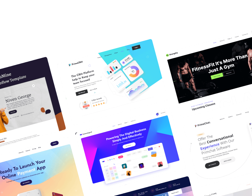
Meet trusted Webflow care agencies specializing in optimization, speed monitoring, custom updates, and proactive issue prevention to protect your digital presence.
Meet trusted Webflow care agencies specializing in optimization, speed monitoring, custom updates, and proactive issue prevention to protect your digital presence.
July 8, 2026
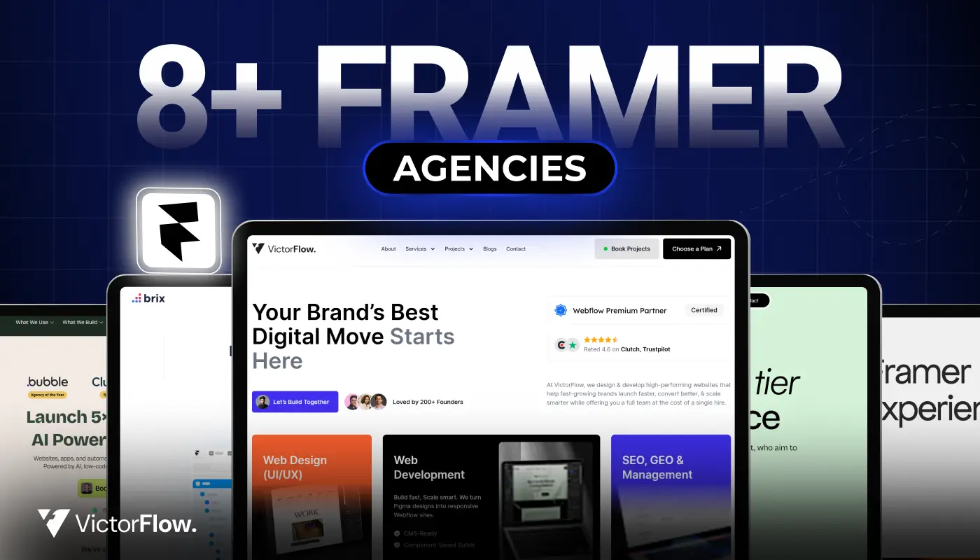
Find the best Framer agencies in 2026 for startups and brands. Compare top teams based on design, performance, and expertise.
Find the best Framer agencies in 2026 for startups and brands. Compare top teams based on design, performance, and expertise.
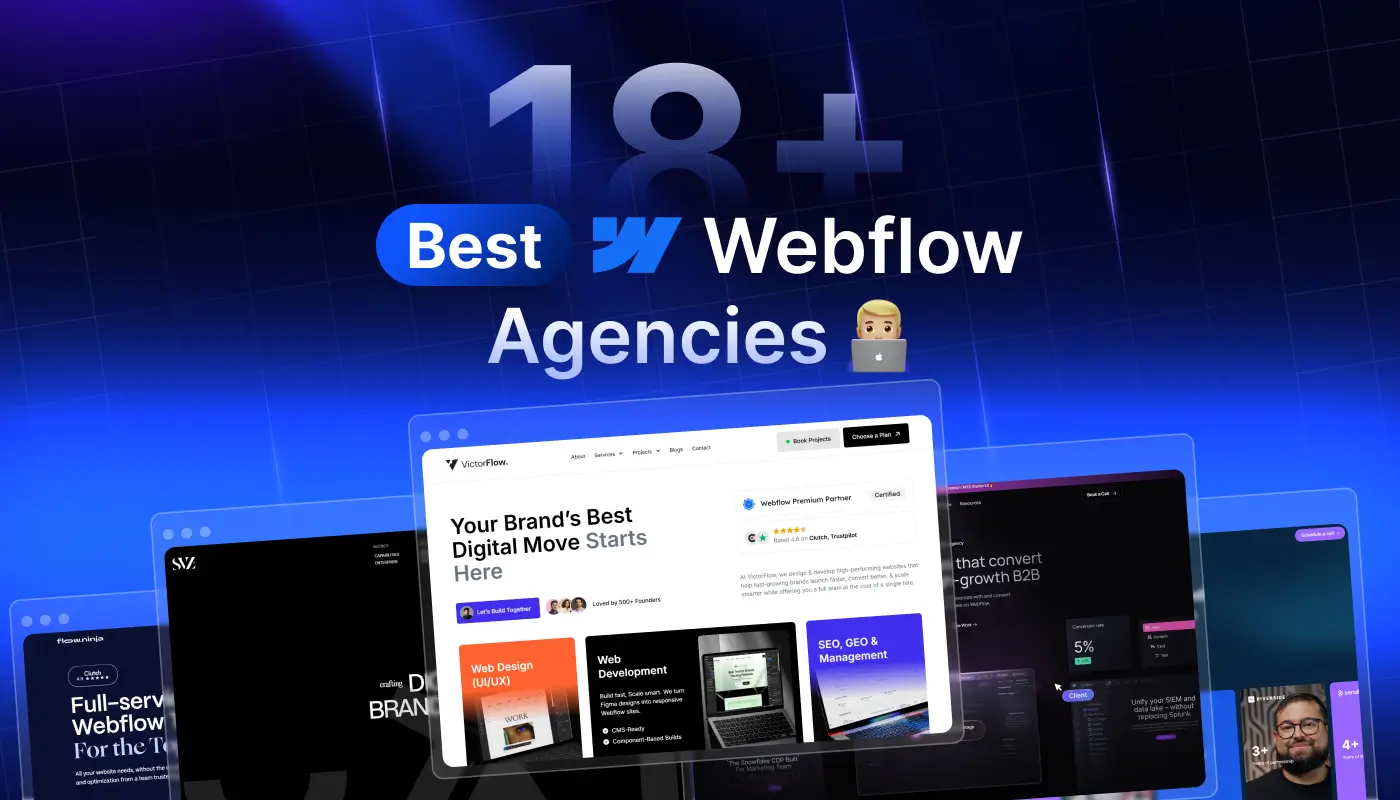
Compare 18+ best Webflow agencies in 2026, vetted by experts. Find the right partner by specialty, budget, and project type. From startups to enterprise.
Compare 18+ best Webflow agencies in 2026, vetted by experts. Find the right partner by specialty, budget, and project type, from startups to enterprise.
Ready to Scale Your Project to the Next Level?
Let's take your project to new heights, reach out and see how we can help you.


Top-rated by customers


© 2026 VictorFlow (A Unit of UIXFlow Private Limited), All Rights Reserved