January 28, 2026
18+ Best Color Combinations For Designers in 2026 | Professional Guide

Choosing the Best color combination is crucial for any design project. The right palette can evoke emotions, enhance brand identity, and make a design stand out.
This guide explores for designers, offering inspiration and practical examples.
In this guide, we’ll explore 18+ of the best color combinations for designers to create stunning visuals.
From classic pairings to bold and modern palettes, these color combinations will help you bring your creative vision to life.
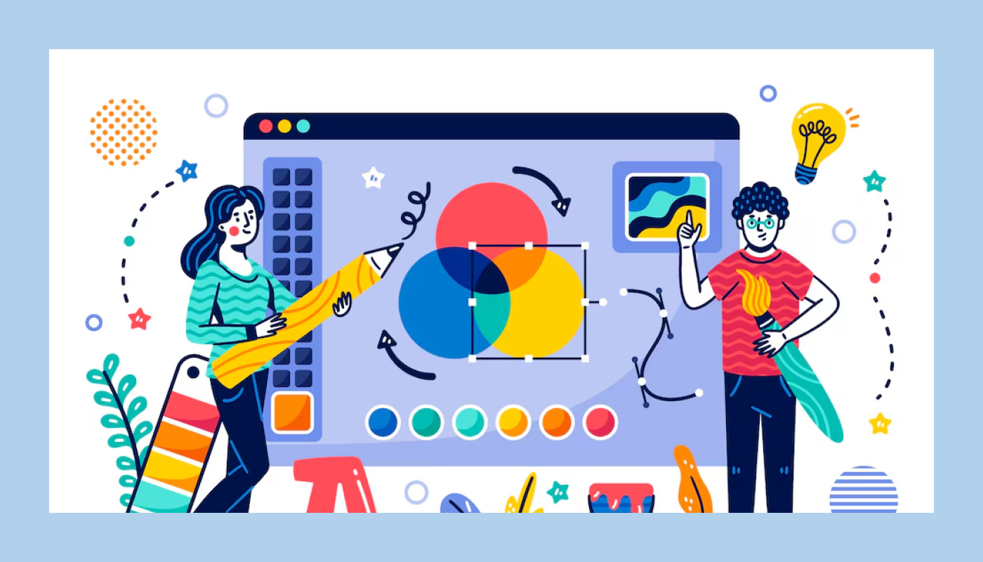
Why Color Matters in Design
Choosing the right color combination is crucial for any design project. The perfect palette can evoke emotions, enhance brand identity, and make a design stand out. Color is one of the most powerful tools in a designer's arsenal. Whether you're just starting or a seasoned pro, understanding color theory can take your work to the next level.
The Power of Color in Design
Color does more than just make things look pretty. It evokes emotions, influences perceptions, and even drives decision-making. From shaping brand identities to enhancing user experiences, mastering color theory helps designers communicate effectively.
Understanding Color Theory
Color theory is the foundation of creating harmonious designs. It explains how colors interact and the emotional responses they trigger. Knowing these principles helps you craft compelling color palettes that resonate with your audience.
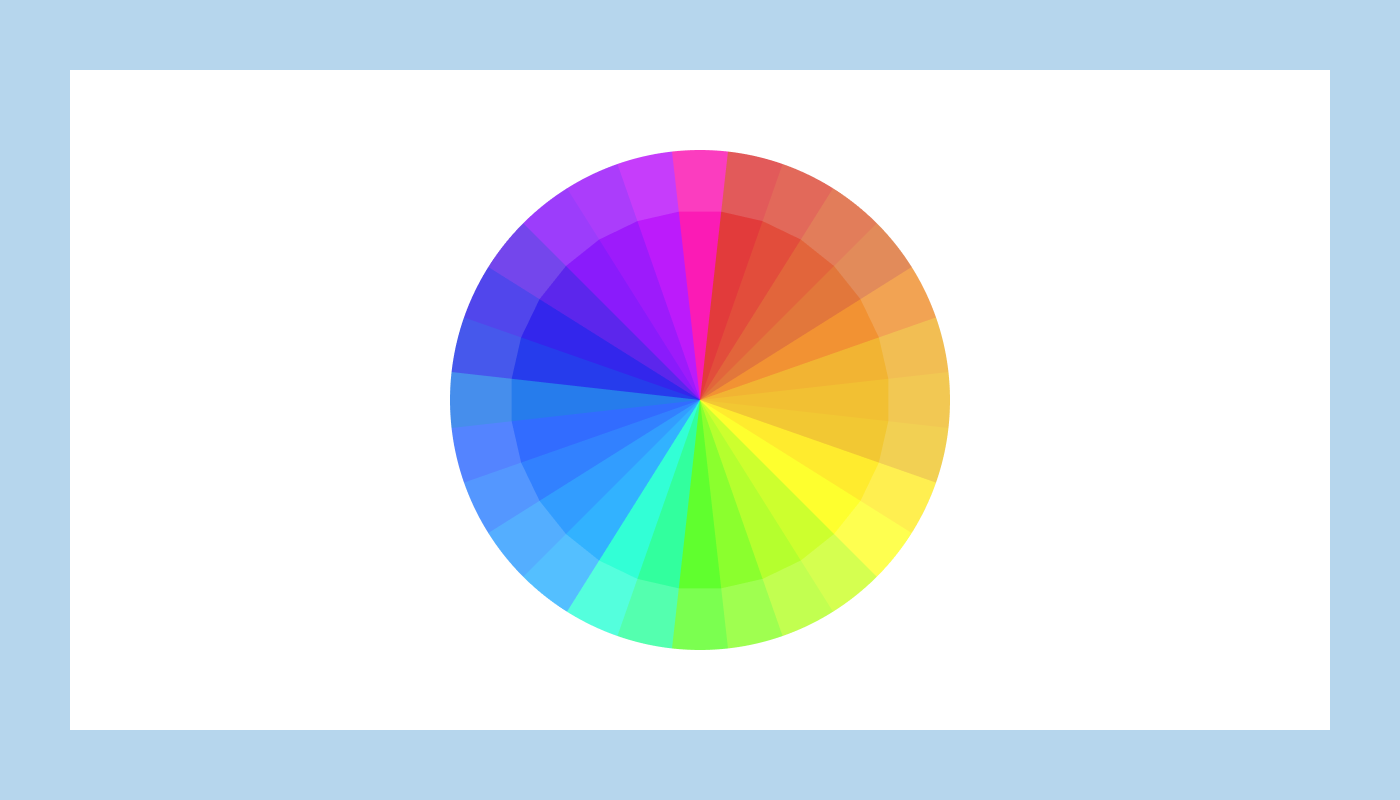
The Color Wheel: Your Visual Guide
The color wheel is a tool that maps out color relationships. First introduced by Sir Isaac Newton in 1666, it categorizes colors into three main groups:
- Primary Colors: Red, Yellow, Blue
- Secondary Colors: Orange, Green, Violet (formed by mixing primary colors)
- Tertiary Colors: Red-Orange, Yellow-Green, Blue-Violet, and more (created by mixing primary and secondary colors)
Color Combinations That Work
Mastering color combinations unlocks endless creative possibilities. Here are four essential types:
- Complementary Colors: Opposite on the color wheel, these combos create high contrast and vibrant designs. Example: Red and Green.
- Analogous Colors: Adjacent to the wheel, they offer a harmonious look. Example: Blue, Blue-Green, and Green.
- Triadic Colors: Three evenly spaced colors form bold, balanced palettes. Example: Red, Yellow, and Blue.
- Tetradic Colors: Four evenly spaced colors create rich and complex combinations. Examples: Red, Yellow-Green, Blue, and Violet.
Warm vs. Cool Colors
Split the wheel in half to distinguish warm and cool tones:
- Warm Colors: Reds, Oranges, and Yellows convey energy and excitement.
- Cool Colors: Blues, Greens, and Violets evoke calmness and tranquility.
Applying Color Theory in Design
Successful brands leverage color psychology to evoke desired emotions. Think Coca-Cola's bold red or Facebook's calming blue. The right palette can leave a lasting impression, build trust, and boost brand recognition.
Pro Tip: Experiment with Color Tools
To refine your skills, play around with color palette generators and explore how different shades interact. Understanding these principles lets you create eye-catching logos, websites, and brand identities.
Explore 18+ Stunning Color Combinations

In this guide, we’ll explore 18+ of the best color combinations for designers to create stunning visuals. From classic pairings to bold and modern palettes, these color combinations will help you bring your creative vision to life.
Ready to elevate your design game? Dive into the world of color theory and watch your creativity soar!
"Struggling to pick the right color palette?
Book a free color strategy call & create designs that truly stand out."
Table of Contents
- Why Color Combinations Matter in Design?
- The Psychology of Colors
- How to Choose the Right Color Combinations?
- 18+ Best Color Combinations For Designers (List below)
- Tools to Help You Choose Colors
1. Why Color Combinations Matter in Design?

Color combinations play a significant role in design by setting the tone and mood. They influence how users interact with and perceive your designs, whether for branding, websites, or marketing materials.
2. The Psychology of Colors

Understanding color psychology can help designers choose palettes that align with their design goals. Colors can evoke feelings, convey messages, and influence decisions.
3. How to Choose the Right Color Combinations?
When selecting color combinations, consider your brand’s message, the emotions you want to evoke, and the audience you are targeting. Balancing contrast and harmony is key.
4. The 18+ Best Color Combinations For Designers
1. Classic Blue and White

Timeless and professional, ideal for corporate and minimalist designs.
The combination of classic blue and white is timeless and versatile, offering a clean and sophisticated look.
This color scheme is widely used in both modern and traditional designs, delivering a sense of tranquility and stability.
Design Uses:
- Web Design: Blue and white create a professional and trustworthy feel, ideal for corporate websites and tech brands.
- Branding: Works well for brands that want to convey reliability, calmness, and simplicity.
HEX Codes:
- Classic Blue: #0D6EFD
- White: #FFFFFF
2. Mint Green and Soft Pink

Creates a fresh and calming effect, perfect for modern designs.
The combination of mint green and soft pink creates a refreshing and gentle aesthetic, perfect for designs that aim to evoke calmness and playfulness.
This palette is often associated with springtime, femininity, and a lighthearted vibe.
Design Uses:
- Web Design: Ideal for lifestyle, beauty, and wellness brands looking to create a fresh and inviting feel.
- Branding: Works well for brands with a soft, approachable, and youthful identity.
HEX Codes:
- Mint Green: #98FF98
- Soft Pink: #FFC0CB
3. Bold Red and Black

Striking and intense, great for attention-grabbing visuals.
The combination of bold red and black creates a striking and powerful aesthetic, perfect for designs that need to convey strength, passion, and intensity.
This color pairing is often used in high-impact visuals and designs that demand attention.
Design Uses:
- Web Design: Great for sports, fashion, and tech brands looking for a bold and modern look.
- Graphic Design: Ideal for posters, advertisements, and banners that need to stand out.
- Branding: Works well for brands with an edgy, dynamic, or luxurious identity.
HEX Codes:
- Bold Red: #FF0000
- Black: #000000
4. Pastel Yellow and Gray

Adds a soft and welcoming feel to designs. The combination of pastel yellow and gray creates a soft, modern, and sophisticated aesthetic.
The cheerful and light vibe of pastel yellow is beautifully balanced by the neutrality and calmness of gray, making this duo perfect for designs that need a welcoming yet elegant feel.
Design Uses:
- Web Design: Ideal for lifestyle, wellness, or creative websites that want a warm and approachable atmosphere.
- Graphic Design: Great for social media graphics, invitations, and light-themed branding.
- Branding: Suits brands that want to convey positivity, calmness, and reliability.
HEX Codes:
- Pastel Yellow: #FDFD96
- Gray: #A9A9A9
5. Navy and Gold

Elegant and luxurious, often used in high-end branding.
The combination of navy and gold exudes sophistication, luxury, and elegance. The deep and calming effect of the navy is beautifully contrasted by the warmth and opulence of gold, making this pairing a timeless choice for high-end designs.
Design Uses:
- Web Design: Ideal for luxury brands, corporate websites, or portfolios that aim to showcase professionalism and prestige.
- Graphic Design: Works well in event invitations, posters, and packaging for premium products.
- Branding: Perfect for creating a strong, authoritative, and upscale brand image.
HEX Codes:
- Navy: #0A2342
- Gold: #FFD700
6. Teal and Coral

A vibrant and energetic combination that suits creative projects.
Teal and coral create a vibrant and harmonious color scheme that blends cool tranquility with warm energy.
Teal offers a sense of stability and sophistication, while coral brings a playful and lively touch, making this combination ideal for dynamic yet balanced designs.
Design Uses:
- Web Design: Great for modern, youthful, or tropical-themed websites.
- Graphic Design: Ideal for event graphics, social media posts, and cheerful illustrations.
- Branding: Suitable for brands that want to project a friendly, approachable, and creative vibe.
HEX Codes:
- Teal: #008080
- Coral: #FF6F61
7. Purple and Orange

Combines warmth and creativity, good for playful designs.A creative and bold combination that offers an artistic and adventurous feel.
Purple and orange together bring a vibrant and dynamic energy to designs. Purple adds a sense of creativity and luxury, while orange infuses warmth and enthusiasm, making this duo perfect for eye-catching and imaginative projects.
Design Uses:
- Web Design: Ideal for creative portfolios, art-focused websites, and youth-oriented platforms.
- Graphic Design: Perfect for dynamic event posters, social media graphics, and playful illustrations.
- Branding: Suitable for brands that want to convey creativity, innovation, and a vibrant spirit.
HEX Codes:
- Purple: #A32CC4
- Orange: #FF6F3C
8. Black and Yellow

High contrast and energetic, ideal for cautionary or bold messaging. A bold and attention-grabbing combination often used for impactful and high-contrast designs.
Black and yellow create a striking visual contrast that captures attention immediately.
Black adds a sense of grounded, earthy feel.
Perfect for designs that promote relaxation and harmony.
Design Uses:
- Web Design: Ideal for impactful landing pages and bold calls to action.
- Graphic Design: Great for posters, event graphics, and warning signs.
- Branding: Suitable for brands aiming to convey strength, confidence, and a dynamic presence.
HEX Codes:
- Black: #000000
- Yellow: #FFD700
9. Lavender and Sage Green

Soft and smooth, excellent for wellness and lifestyle brands. A serene and natural pairing that evokes tranquility and growth.
Lavender brings a gentle, calming effect, while sage green offers ui visuals, wedding invitations, and lifestyle content.
Design Uses:
- Web Design: Ideal for wellness, lifestyle, or floral-themed websites.
- Graphic Design: Great for soft, inviting social media graphics and print materials.
- Branding: Great for brands focusing on health, well-being, and sustainability.
HEX Codes:
- Lavender: #E6E6FA
- Sage Green: #9CAF88
10. White and Royal Blue

Clean and crisp, giving a trustworthy and fresh look.A fresh and clean combination that brings a modern and crisp feel to designs.
White and royal blue create a high-contrast and sophisticated look that is both versatile and timeless.
White offers a sense of purity and simplicity, while royal blue adds depth and a regal touch, making this combination ideal for professional and contemporary designs.
Design Uses:
- Web Design: Ideal for clean, corporate, or technology-driven websites.
- Graphic Design: Perfect for infographics, presentations, and modern layouts.
- Branding: Suitable for brands that want to project professionalism, trust, and a modern aesthetic.
HEX Codes:
- White: #FFFFFF
- Royal Blue: #4169E1
11. Beige and Olive Green

Earthy and natural, perfect for eco-friendly brands.A natural and harmonious combination that evokes a sense of calm and stability.
Beige and olive green create a grounded and earthy color scheme that blends soft warmth with natural strength.
Beige offers a neutral and comforting backdrop, while olive green brings a fresh and organic feel, making this combination ideal for designs with a rustic or eco-friendly theme.
Design Uses:
- Web Design: Great for nature-inspired or minimalist websites.
- Graphic Design: Ideal for packaging, lifestyle branding, and natural-themed visuals.
- Branding: Suitable for brands focusing on sustainability, wellness, or a down-to-earth image.
HEX Codes:
- Beige: #F5F5DC
- Olive Green: #808000
12. Pink and Gray

Modern and stylish, often used in the fashion and beauty industries.
Pink and gray create a harmonious and elegant color scheme that blends the gentle warmth of pink with the cool neutrality of gray.
This combination is perfect for designs that aim to feel approachable yet stylish and modern.
Design Uses:
- Web Design: Ideal for lifestyle, beauty, or minimalist websites.
- Graphic Design: Great for print materials, social media visuals, and invitations.
- Branding: Suitable for brands that want to express warmth, calm, and contemporary style.
HEX Codes:
- Pink: #FFC0CB
- Gray: #808080
13. Turquoise and Peach

Fun and inviting, suitable for youthful and vibrant brands.A refreshing and lively color combination that blends cool serenity with warm charm.
Turquoise provides a sense of calm and sophistication, while peach introduces a playful and inviting feel.
This pairing is ideal for designs that need a light, cheerful, and approachable tone.
Design Uses:
- Web Design: Ideal for light, friendly, and creative websites.
- Graphic Design: Great for social media graphics, promotional materials, and playful illustrations.
- Branding: Works well for brands targeting a youthful and energetic audience.
HEX Codes:
- Turquoise: #40E0D0
- Peach: #FFDAB9
14. Red and White

Simple and effective, ideal for brands needing a clear and impactful look. A bold and classic pairing that delivers a clean and powerful look.
Red brings energy and passion, while white adds balance and clarity. This combination works well for impactful designs where contrast and simplicity are key.
Design Uses:
- Web Design: Ideal for call-to-action buttons and minimalist websites.
- Graphic Design: Great for posters, banners, and bold statements.
- Branding: Excellent for brands that want a fresh, energetic, and trustworthy image.
HEX Codes:
- Red: #FF0000
- White: #FFFFFF
15. Orange and Blue

Complementary and balanced, great for tech and corporate designs. A vibrant and dynamic color combination that balances warmth and coolness.
Orange brings energy and enthusiasm, while blue offers calmness and stability, making this pairing perfect for engaging and balanced designs.
Design Uses:
- Web Design: Excellent for tech, education, or travel websites.
- Graphic Design: Works well for infographics, dynamic presentations, and promotional materials.
- Branding: Ideal for brands that want to communicate trustworthiness along with a fun, energetic vibe.
HEX Codes:
- Orange: #FFA500
- Blue: #007BFF
16. Green and Gold

Fresh and prestigious, suitable for luxury and organic brands. A rich and luxurious combination that exudes elegance and prosperity.
Green and gold combine the freshness and vitality of green with the warmth and opulence of gold.
This combination is perfect for sophisticated and elegant designs, adding a sense of wealth and abundance.
Design Uses:
- Web Design: Ideal for luxury brands, finance, and wellness websites.
- Graphic Design: Great for promotional materials, invitations, and high-end product designs.
- Branding: Suitable for brands aiming for a premium and timeless appeal.
HEX Codes:
- Green: #006400
- Gold: #FFD700
17. Monochromatic Grays

Sophisticated and versatile, works well for modern and minimalist styles.A sleek and modern choice for minimalist and professional designs.
Monochromatic grays create a balanced and versatile color palette by using different shades of gray. This scheme offers a sophisticated and neutral backdrop that can make accent colors or design elements stand out.
Design Uses:
- Web Design: Ideal for clean and professional websites, portfolios, or corporate designs.
- Graphic Design: Great for backgrounds, infographics, and presentations where focus is needed.
- Branding: Works well for brands that value simplicity, professionalism, and elegance.
HEX Codes:
- Light Gray: #D3D3D3
- Medium Gray: #A9A9A9
- Dark Gray: #696969
18. Aqua and Purple

Unique and dynamic, perfect for creative and innovative designs.
Aqua and purple create a fresh and modern combination that combines the coolness of water with the depth of creativity. Aqua brings a calming and refreshing feel, while purple adds a sense of mystery and imagination.
This duo is perfect for playful, artistic, and forward-thinking designs.
Design Uses:
- Web Design: Ideal for vibrant and unique websites that want to stand out.
- Graphic Design: Works well for creative projects, event graphics, and social media visuals.
- Branding: Suitable for brands that aim to showcase innovation and creativity.
HEX Codes:
- Aqua: #00FFFF
- Purple: #800080
19. Brown and Cream

Warm and cozy, excellent for hospitality and home decor brands.
A warm and inviting combination that exudes comfort and elegance. Brown and cream create a cozy and classic color scheme that combines earthy richness with soft neutrality.
Brown brings a grounded and stable feel, while cream adds a touch of lightness and sophistication, making this combination perfect for traditional and timeless designs.
Design Uses:
- Web Design: Ideal for rustic, natural, or vintage-themed websites.
- Graphic Design: Great for packaging, posters, and print materials with a classic touch.
- Branding: Perfect for brands focusing on comfort, reliability, and heritage.
HEX Codes:
- Brown: #8B4513
- Cream: #FFFDD0
20. Silver and Black

Sleek and professional, often used in the tech and automotive industries. A sleek and modern choice that exudes professionalism and luxury.
Silver and black combine to create a sophisticated and timeless color scheme.
The sleek, metallic feel of silver pairs seamlessly with the bold, grounding effect of black, making this combination ideal for designs that aim to convey elegance and high-end appeal.
Design Uses:
- Web Design: Ideal for professional, luxury, or technology-focused websites.
- Graphic Design: Great for modern business materials, logos, and product packaging.
- Branding: Perfect for brands that want to project a sense of quality and exclusivity.
HEX Codes:
- Silver: #C0C0C0
- Black: #000000
5. Tools to Help You Choose Colors
- Adobe Color: For creating and exploring color palettes.
- Coolors: Quickly generate color schemes.
- Color Hunt: Discover trending color combinations.
- Paletton: Great for experimenting with color harmonies.
Conclusion
Choosing the right color combinations can elevate your designs and help convey the right message. With these 18+ color pairings, designers can find inspiration and enhance their creative projects.
Color combinations are a powerful design tool that can transform the look and feel of your projects. By understanding color theory, exploring different palettes, and experimenting with unique combinations, you can create designs that not only look appealing but also convey your intended message effectively.
Are you are looking for classic, bold, pastel, or nature-inspired palettes, this guide provides a solid foundation for making informed and creative color choices.
Always consider your audience and design goals to select the best color combinations that will resonate and engage effectively.

FAQ
1. What makes a color combination effective in modern design?
An effective color combination creates visual harmony, supports brand messaging, and enhances readability across digital and print mediums while staying accessible.
2. How do I choose the right color palette for a new brand?
Start with the brand’s personality, audience, and industry tone, then narrow down colors using mood boards, contrast checks, and accessibility standards.
3. Are 2026 color trends suitable for long-term branding?
Yes, many 2026 palettes focus on balanced neutrals, soft gradients, and bold accents, all of which adapt well to evolving design styles without feeling outdated quickly.
4. What tools can help me generate color combinations?
Designers frequently use tools like Adobe Color, Coolors, Color Hunt, and Figma plugins to test, preview, and refine palettes effortlessly.
5. How important is color accessibility in 2026 designs?
Accessibility is crucial. Proper contrast ratios ensure text readability, improve user experience, and keep websites compliant with WCAG guidelines.
6. Can I mix trendy colors with my existing brand palette?
Absolutely, strategic updates work well. Introduce trends as accent colors, gradient overlays, or UI highlights to modernize your brand while preserving identity.


Choose Our Service, Grow Fast!
Follow Us


Table of Contents
Related Posts

July 8, 2026
Meet trusted Webflow care agencies specializing in optimization, speed monitoring, custom updates, and proactive issue prevention to protect your digital presence.
Meet trusted Webflow care agencies specializing in optimization, speed monitoring, custom updates, and proactive issue prevention to protect your digital presence.
July 8, 2026
Find the best Framer agencies in 2026 for startups and brands. Compare top teams based on design, performance, and expertise.
Find the best Framer agencies in 2026 for startups and brands. Compare top teams based on design, performance, and expertise.

Compare 18+ best Webflow agencies in 2026, vetted by experts. Find the right partner by specialty, budget, and project type. From startups to enterprise.
Compare 18+ best Webflow agencies in 2026, vetted by experts. Find the right partner by specialty, budget, and project type, from startups to enterprise.
Ready to Scale Your Project to the Next Level?
Let's take your project to new heights, reach out and see how we can help you.


Top-rated by customers


