December 30, 2025
Fix Long Forms and Boost Your Conversions | A Step-by-Step Guide

Long forms often create friction that discourages users from completing important submissions across landing pages, contact flows, and SaaS funnels. User frustration grows when forms feel overwhelming, unclear, or poorly structured, especially when visitors arrive seeking quick answers or fast interactions.
Strong conversion design focuses on guiding users through short, logical steps instead of confronting them with crowded layouts or unnecessary inputs. Modern audiences appreciate simplicity because reduced effort supports smoother interactions and encourages them to trust your brand.
Visual clarity plays a key role in helping users understand what is required while preventing second-guessing or abandonment. Consistent spacing and digestible grouping significantly improve the user’s ability to process information and move confidently through the form.
Marketers often discover that long forms hide issues such as irrelevant fields, unclear labels, or outdated logic that interrupts conversion flow. Improving UX through thoughtful restructuring removes obstacles that previously damaged completion rates and potential lead quality.
Well-designed forms also support mobile users by delivering quick, accurate, and friction-free interactions regardless of device type. Effective optimization allows businesses to collect valuable information while still respecting user time, attention, and intent.
"Upgrade your conversion flow easily.
Book a consultancy call for expert form fixes."
Table of Contents
- Why Long Forms Hurt Conversions?
- The Multi-Step Form Solution
- Using Visual Selections for Better UX
- Seamless Integration with Calendly
- Putting It All Together
1. Why Long Forms Hurt Conversions?

Users don’t like friction. The more effort they have to put in, the higher the chances they’ll leave. Studies show that forms with more than 5-7 fields see a significant drop in completion rates.
A single long form feels overwhelming, especially on mobile. Every extra field is a potential exit point.
Now, some fields are necessary - you need essential details from the user - but instead of presenting them all at once, you need to break them down into smaller steps.
2. The Multi-Step Form Solution

A multi-step form breaks down the process into digestible sections, showing users one step at a time. Instead of seeing 12 fields at once, they see 3-4 fields per step, with clear progress indicators.
This reduces the cognitive load and makes completing the form feel easier. Each step feels like a small win, keeping users engaged.
For example, the first step might only ask for a name and email. The next step gathers business details. The final step collects preferences.
Users don’t feel like they’re being bombarded with a long form, even though they’re providing the same amount of information.
3. Using Visual Selections For Better UX

Instead of making users type everything, use buttons, toggles, or image-based selections to make the process intuitive.
If you’re asking about budget, show predefined options instead of a blank input field. If you need to know company size, use selectable buttons.
This not only makes the form look more engaging but also reduces decision fatigue.
Think about platforms like Airbnb. When choosing amenities, you don’t type ‘WiFi, Parking, Pool’ — you tap icons. It’s faster and easier. The same logic applies here. The less manual effort required, the higher the completion rate.
4. Seamless Integration with Calendly

Now, here’s where most businesses fail — they collect all this information but still make users manually fill out another form when booking a demo or consultation. This is a missed opportunity. Instead of redirecting users to a blank Calendly form where they have to enter their details again, you should pre-fill all their information using URL parameters.
Here’s how it works: After a user completes your website form, the collected data is automatically passed into the Calendly link using URL parameters. The name, email, company, and any other relevant details are already pre-filled, so the only thing left for the user to do is confirm the appointment.
For example, instead of sending them to a standard booking page, you can generate a custom link like this:
https://www.calendly.com/yourlink/15min?name=John%20Smith&email=john@acme.com&a1=1200USD
In these URL parameters, you see A1. You can add A2, A3, and so on for any custom questions you ask, other than Calendly's default name and email fields.
Want a deeper dive into how to set this up? Check out Calendly's guide to pre-populating invitee information.
5. Putting It All Together
What does an optimized form look like? First, it’s multi-step, breaking down fields into smaller sections to avoid overwhelming users. Second, it replaces manual text input with visual selections where possible, making it faster and more intuitive.
Finally, it integrates seamlessly with Calendly or any other scheduling tool by passing user data as URL parameters, so they don’t have to re-enter details.
This small change alone can dramatically improve demo and consultation bookings. Instead of making users struggle through a long, exhausting process, you guide them smoothly to the finish line.
Conclusion
Form optimization often becomes the difference between wasted traffic and meaningful conversions that grow your business. Smaller improvements compound quickly once visitors feel they can complete tasks without confusion or unnecessary effort.
Structured layouts give users clarity about what matters most, helping them focus on completing the form rather than navigating obstacles. Fast performance and straightforward design empower users to complete forms using the least cognitive load possible.
Clarity in field labels, spacing, and guidance reduces abandonment rates by eliminating hesitation and guesswork. Businesses benefit from sharper insights since improved forms bring in more reliable, accurate, and consistent submissions.
User trust rises naturally when forms feel respectful of time and avoid overwhelming visitors during key decision moments. Focusing on simplicity and user-first design ultimately leads to higher conversions and far stronger overall communication outcomes.

FAQ
1. What causes long forms to have low conversions?
Too many fields, unclear layout, and confusing flow commonly discourage users from completing submissions.
2. How can I simplify an existing long form?
Reducing fields, grouping sections, rewriting labels, and restructuring steps helps create a smoother experience.
3. Why does field order matter for conversions?
Logical sequences reduce cognitive load and make tasks feel simpler for users completing the form.
4. Where should validation and error messages appear?
Inline validation near the field keeps users confident and prevents frustration during submission.
5. Who benefits the most from short, optimized forms?
Any business that relies on leads, sign-ups, applications, or requests gains instant improvement in conversion rates.
6. How often should form performance be reviewed?
Regular checks ensure layout, logic, and messaging match evolving user expectations and conversion goals.


Choose Our Service, Grow Fast!
Follow Us


Table of Contents
Related Posts

July 8, 2026
Meet trusted Webflow care agencies specializing in optimization, speed monitoring, custom updates, and proactive issue prevention to protect your digital presence.
Meet trusted Webflow care agencies specializing in optimization, speed monitoring, custom updates, and proactive issue prevention to protect your digital presence.
July 8, 2026
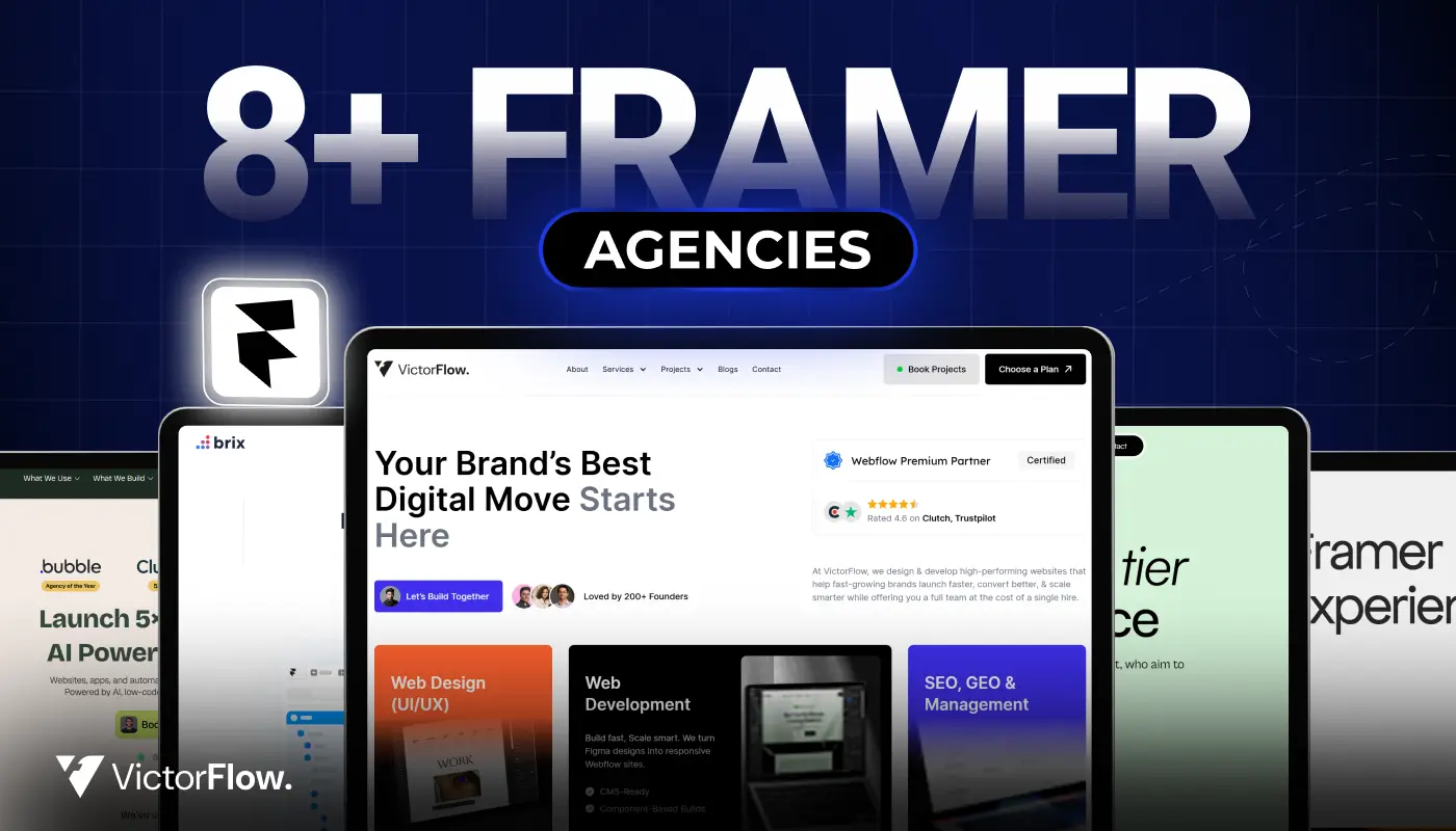
Find the best Framer agencies in 2026 for startups and brands. Compare top teams based on design, performance, and expertise.
Find the best Framer agencies in 2026 for startups and brands. Compare top teams based on design, performance, and expertise.
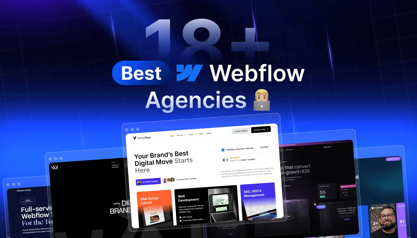
Compare 18+ best Webflow agencies in 2026, vetted by experts. Find the right partner by specialty, budget, and project type. From startups to enterprise.
Compare 18+ best Webflow agencies in 2026, vetted by experts. Find the right partner by specialty, budget, and project type, from startups to enterprise.
Ready to Scale Your Project to the Next Level?
Let's take your project to new heights, reach out and see how we can help you.


Top-rated by customers


